Friday, 18 December 2015
Wednesday, 16 December 2015
professional project: week 9-10 (8th-16th december) (5) remaking the concept
Since we were given feedback to keep the concept more fun with Wolverhampton university client and make it less busy with the use of descriptive words that's to do with animation, my fellow colleague Andrew thought up a change in the concept but without wasting some of the main aspects of work we've conducted.
For this he thought up the idea of playing with the letters of 'animation' by making them interact with the character we've created in the original concept but not forcing with uniquely animating each letter as it would take too much time.
new concept storyboard


 As I got the idea down into another storyboard it clearly shows that this can be simple to animate within the time limit left we have and use of beginning, ending elements from the Wolverhampton university website aswell as the character we've created shows we're not wasting the idea totally. For the character to be motivated and interact better with the letters we thought the idea of having a creature in the shape of ball chase after him but to create more of a purpose with the ball we will make sure it interacts and be apart of the letters instead of the audience thinking what's more to this than chasing the main character.
Animatic and tests
Below shows our start in animating this promotional video through quick tests and making a start on the full animatic. The goal I wanted to achieve when producing these tests is to determine how the character and ball should move and interact with the animated letters.
The main initiative when creating the movements is simple stick men and a circle that comes alive to get a good feel on how they would flow on the screen.
The first plays around with how the characters would land and interact with objects before adding the letters and colour so it gives me a clear idea on how I can animate this easily and easily see if there is any improvements that need to be made before producing rough shapes then detail.
The second plays on how the objects and characters interact with each other to give each one a purpose in this film. I also started to contribute colour into the film to see how well they play out and from the look I would need to improve upon it to give it a better on look but still keep it to the client brief of undergraduate and corporate colours. This test also played around with how the letters would look, be seen clearly in front of the background and keeping it to the rockwell font as suggested by marketing.
The next step is to start out rough shapes of the characters and detail to envision the facial expressions and movements before doing the clean up.
Also as a side note, as I am creating the 2d elements of animation, Andrew will contribute the main aspects of improving the music, editing and creating the shapes for the title, ending scenes and throughout the animated letters sequences. The main shapes use would be circles and diamonds as they would contribute with the colour scheme and keep it fundamentally towards the Wolverhampton client.
For this he thought up the idea of playing with the letters of 'animation' by making them interact with the character we've created in the original concept but not forcing with uniquely animating each letter as it would take too much time.
new concept storyboard


The first two scenes are kept the same towards the previous concept and it made it easy to produce what would go into the next shot.


Animatic and tests
Below shows our start in animating this promotional video through quick tests and making a start on the full animatic. The goal I wanted to achieve when producing these tests is to determine how the character and ball should move and interact with the animated letters.
The main initiative when creating the movements is simple stick men and a circle that comes alive to get a good feel on how they would flow on the screen.
The second plays on how the objects and characters interact with each other to give each one a purpose in this film. I also started to contribute colour into the film to see how well they play out and from the look I would need to improve upon it to give it a better on look but still keep it to the client brief of undergraduate and corporate colours. This test also played around with how the letters would look, be seen clearly in front of the background and keeping it to the rockwell font as suggested by marketing.
The next step is to start out rough shapes of the characters and detail to envision the facial expressions and movements before doing the clean up.
Also as a side note, as I am creating the 2d elements of animation, Andrew will contribute the main aspects of improving the music, editing and creating the shapes for the title, ending scenes and throughout the animated letters sequences. The main shapes use would be circles and diamonds as they would contribute with the colour scheme and keep it fundamentally towards the Wolverhampton client.
Thursday, 10 December 2015
pre-production presentation and stages
Updated Synopsis and treatment


production schedule
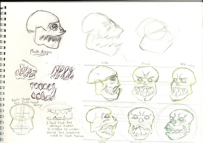
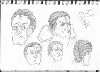
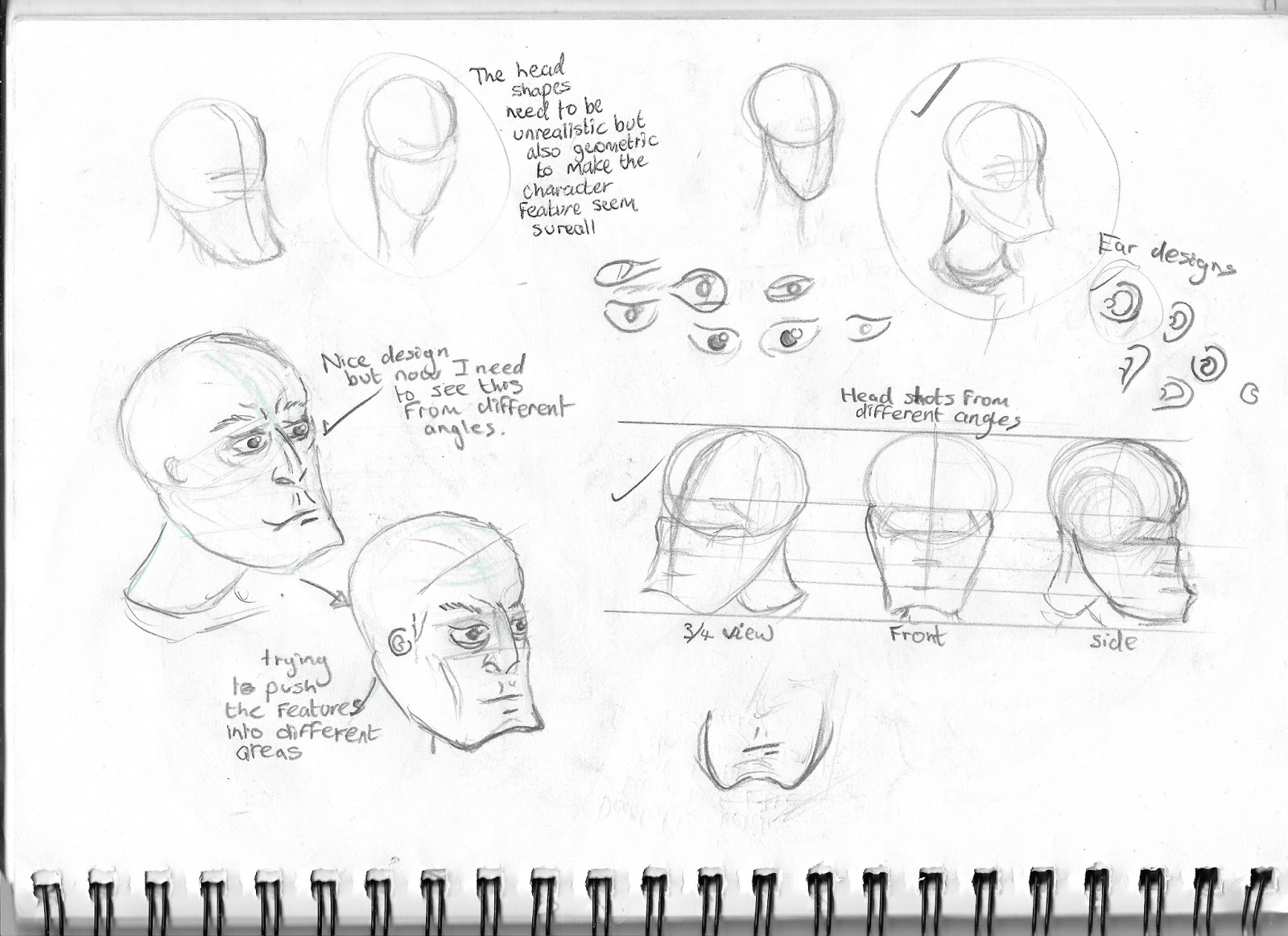
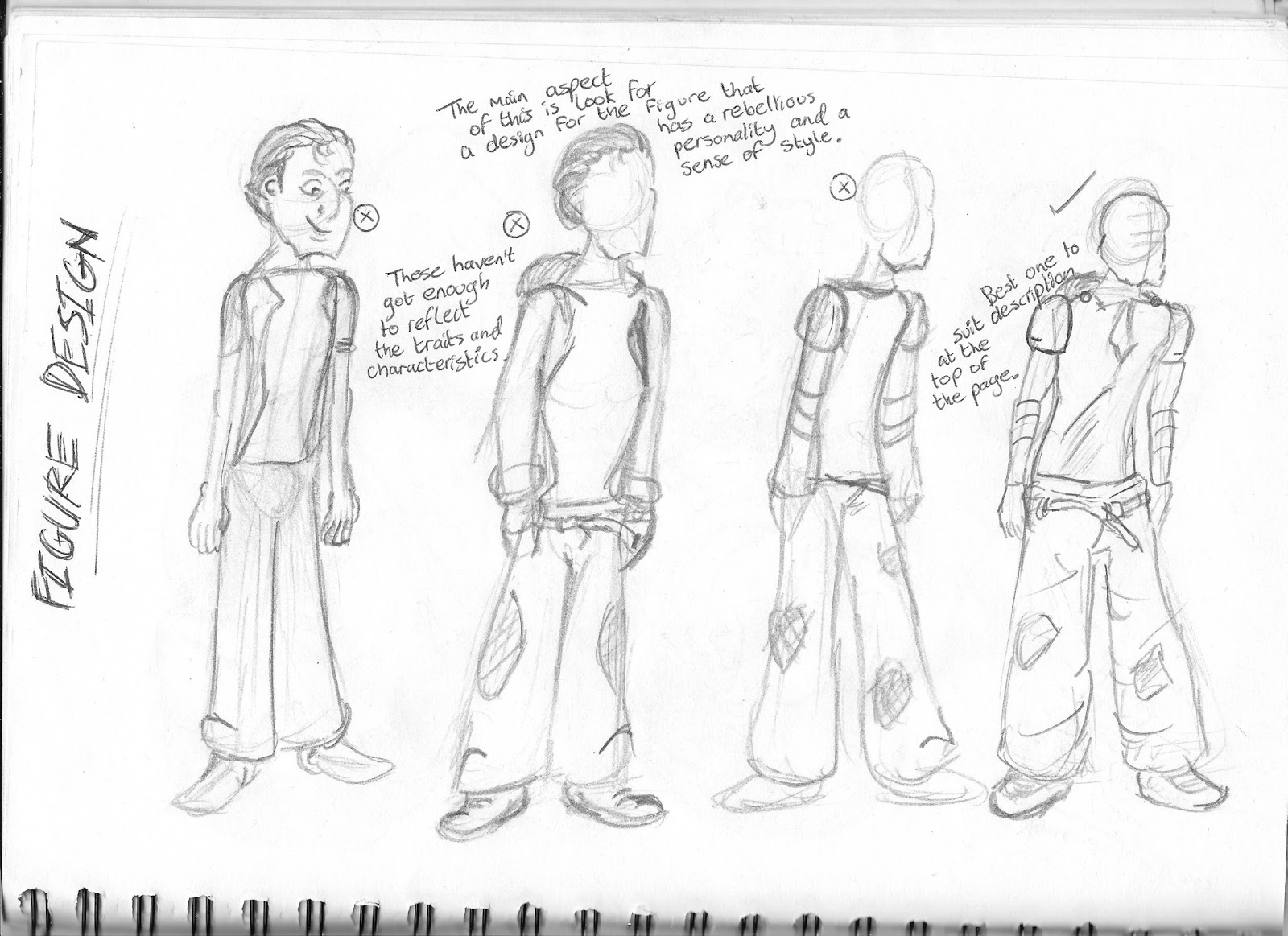
 character development


 Feedback from lecturers and peers
The story begins in apartment block 15
where a boy called Tyler is bored and infuriated that his stressed out mother,
Trish would not let him go out with his friends believing the area is dangerous
at night. But his thoughts on the matter start to differ after Trish tells him
a scary story of how creatures called ghouls come out of the brink of nightfall
and stalk the streets for prey. She tells him that they don’t just stalk any
prey, they take children as they are the easiest target. She ends her story by telling that when they
find their prey, they would either take the victims to be eaten or turned into
their own kin.
This scares the boy satisfying Trish's
worrying nature but once she’s out of the room, Tyler takes no belief in this
silly tale and plans his escape for meeting with his friends.
But tonight what he doesn’t realize is
that these ghouls are real and are hunting for prey this very night. They come
out the drainage system in a group of three and begin to hunt. They spot the
block and start to climb the structure without being noticed by the residents.
Once they caught the scent of the Tyler they climb through an opened window one
by one whilst being unnoticed by Trish and Tyler himself as he is getting ready
to go out.
As they ready themselves to nab the kid, Tyler
realizes what’s happening, turns around to face his attackers and transforms
into a werewolf. To the shock of the ghouls, they try to escape but tyler
catches them off guards and rips them apart with his teeth and claws.
By the end, only one ghoul escapes the
on slaughter and comes to realize they’ve chosen
the wrong kid to take this night especially when it
sees the full moon drifting clearly in the night's sky.
Once the ghoul is clear of the vicinity,
Tyler climbs out of the window and follows suit, staring at the moon and hears
other werewolves’ howling call. Tyler is ready to find his pack and hunt for
his own prey night whilst a shocked, dismayed but unsurprised Trish
looks on in the living room.
Pacing: The pacing should be quick to fit
the 90 seconds but it would need quick for the parts that don't contribute to
the important parts of the story. It
would have to keep
the audience engaged with the story but leave time for the
plot
to get an understanding to audience through
visual personalities and traits from characters.
•Style: It would have to be gritty and
dark so it would have influenced art styles of obvious people like Tim Burton.
It should have the sense of being unrealistic and surreal to get the true depth
of the horror genre. The colours would have be presented as decrepit and worn
out.
•target audience:
adults and mostly people over the age of 18.
•mood and overall vibe:
chilling, scary and tense.
•production methods:
use of both hand drawn and computer drawn animation techniques for both the
animatic and the final look for the animation.
•Software: TV paint, after effects
, Adobe
Photoshop.
•sound effects
and
music: It would to be terrifying; unnerving and tense which can help the pacing
of the film. Main music inspirations would come from such films like ‘Jaws’ and ‘The Sandman.’
•editing:
Premiere pro and after effects.
•length of time:
90 seconds.
This will be changed as feedback showed that the narrative would need to be changed and shortened down including a few changes to treatment where appropriate if I make any changes to how I am designing and animating the film.
concept art This will be changed as feedback showed that the narrative would need to be changed and shortened down including a few changes to treatment where appropriate if I make any changes to how I am designing and animating the film.


production schedule
character development 


- Research music inspiration and sound effects when creating the animatic
- Produce animatic and colour scripting
- sort out the storyboard and plot as it has holes in the story as they didn't see how this would come across as a silent film
- use monochrome colour palettes when producing concept art in photoshop
- make sure to address that visuals and character personality traits can explain the story without dialogue
- artist inspirations other than tim burton
- As given by fellow students, they suggest that the kid could already be outside when caught by ghouls
- if using silent techniques don't use names for the characters in the synopsis.
- make sure to do the animatic to see and change scenes and cut outs unimportant plot points if possible to fit into the specified time frame from the brief.
Subscribe to:
Comments (Atom)