Showing posts with label 6DM016 Professional Animation Project. Show all posts

Tuesday, 12 January 2016

6DM016: week 12 (12th January 2016) final product, feedback and personal reflection

This blog post shows the final edit of the promotion including the sound effects, digital effects and music. As me and Andrew finished clean up as he felt some parts of the animation was abit messy, editing was put together by Andrew and as we were gaining each other's opinion on if we were happy with the final product we decided to experiment with trying this animation out with different music tracks collected when researching the project. When we presented the final product to our peers, lecturer and marketing, Emily mantel suggested as we showed her another audio track on the animation is to have a multiple clips of the same animation but with different music to get everyone else's opinion in what works best.

Below shows the first version with the original sound we played with for contribute to the animation.
Here also is the link to video on vimeo: https://vimeo.com/151421420
Music Credits:
Metronomix -
Metronomix by CSoul (c) 2011 Licensed under a Creative Commons Attribution (3.0) license. ccmixter.org/files/CSoul/33157 Ft: spinningmerkeba,Jeris,morusque
-Sound Effects:
Recorded by Mike Koenig (soundbible.com) License: Attribution 3.0
andre.rocha.nascimento (freesound.org/people/andre.rocha.nascimento/sounds/51460/)
Goldy-sama (freesound.org/people/Goldy-sama/sounds/4239/)


the second version: https://vimeo.com/151421421
Music Credits
Urbana-Metronica (wooh-yeah mix) - dig.ccmixter.org/files/jlbrock44/33345
Urbana-Metronica (wooh-yeah mix) by spinningmerkaba (c) 2011 Licensed under a Creative Commons Attribution (3.0) license. ccmixter.org/files/jlbrock44/33345 Ft: Morusque, Jeris, CSoul, Alex Beroza

-Sound Effects:
Recorded by Mike Koenig (soundbible.com) License: Attribution 3.0
andre.rocha.nascimento (freesound.org/people/andre.rocha.nascimento/sounds/51460/)
Goldy-sama (freesound.org/people/Goldy-sama/sounds/4239/)


The third version: https://vimeo.com/151421422
Music Credits
New York City (Instrumental)New York City (Instrumental) by spinningmerkaba (c) 2011 Licensed under a Creative Commons Attribution (3.0) license. ccmixter.org/files/jlbrock44/30389
-Sound Effects:
Recorded by Mike Koenig (soundbible.com) License: Attribution 3.0
andre.rocha.nascimento (freesound.org/people/andre.rocha.nascimento/sounds/51460/)
Goldy-sama (freesound.org/people/Goldy-sama/sounds/4239/)
To give it a different concept, Andrew decided to base on when experiencing animation, there are always obstacles in the way given the letters and things that pull back like lack of skill or you always have to develop more to get better but in the end your always able to push forward.

From the given feedback, marketing and our fellow peers loved how it links back to the research and Wolverhampton brief. Marketing felt it's a big change to the previous presentation as they've said it has improved in terms of colour use as they would recognise it straight away from the use of Wolverhampton's two main colours and they've acknowledged that it would be something they would use for marketing purposes. As we shows the three clips, majority of the room decided that the second one with the track urbana metronica was the best. But some felt the third added tension to the animation.
Aswell as positive feedback, the only two things they would like us to change after the module if we revisited this was change certain sound effects as they felt it was out of place and some of the lettering in the end credits would need changing to have all words look the same.

For my personal favourite, the second soundtrack fit better with the animation and sound effects and Andrew's is the third clip.
As a personal reflection, I feel happy with the overall product as we were able to work together for a long period of time than the last time we worked together, being able to gain additional and useful feedback to improve the professional manner of this product to aim at Wolverhampton clients and also being able to formulate a plan to get both of us to take on different job roles and contribute an even amount of work towards the final edit.

Monday, 11 January 2016

6DM016: week 11 & 12 (4th-12th January 2016) scene clean up

As we came back from the Christmas break me and Andrew compromised on what we will do for fit the schedule and keep on track with deadlines. What we did was take on job roles to create the finished project on time as I did the animating in TV paint whilst Andrew continued with editing the music, sound effects and digital effects in Adobe After Effects and Premiere Pro especially when creating the Wolverhampton trademark for the beginning and ending credits. Also as I was cleaning up and creating extra scenes for the animation to fit the original storyboard I sent him across rough copies of each animation to see how it would look when editing together the sound track aswell as seeing what can be improved to create more exaggeration, change of movement and increase better pacing to the overall outcome.

What I did for extra scenes is add the jump down hole sequence and the zoom out scene where the viewer would see the full word 'animation'. I also cleaned up the main two scenes where they animate the letters in terms of changing some frames if the anatomy is wrong, adding outline to creature, blending the shade better and adding extra effects like shadows to make sure each part of the animation doesn't feel out of place.

Below is the scene where the characters interacts with the first five letters of 'animation'.


The second scene shows the characters interacting with the last four letters of 'animation'.

Below shows the extra scenes for the beginning and ending of the promotion with lineart, colour and clean up before editing digital effects behind the drawings.

professional project: (christmas week 1 & 2: 20th december 2015 -2nd january 2016) schedule and creating line art, colour for characters

Over the Christmas period as I was animating the 2nd scene to the animation whilst my team partner Andrew Taylor clean up mine, I focused on creating the final drawing outline to what the character would look like based on design work we envisioned for the character aswell as add a particular but simply warm and cold colour scheme before making the clean up.

Below shows the second scene with clean outlines of what the anatomy would look like for character based on design work. One of my main thought processes I had to come up with when taking on this task is to skip animating the face as I felt it doesn't have a purpose to the promotion as I wanted the body language to express the emotion in this character and acknowledge to the viewers that these traits can make animation look fun as reflected from client feedback.


The second exported clip show the use of colour with inclusion of shading to make him standout in front of the purple background, letters and creature chasing him when he's interacting with the letters.

Below is the schedule that me and Andrew planned to envision what needs to be done in terms of creating a professional project and linking it back to the requirements of the client brief.
 professional project week 1 week 2 week 3 week 4 week 5
 Ideas based on Wolverhampton client      
 research           
 mind map      
 storyboarding           
 animatic 
 concept art and designing           
 2D animation on TV paint
 clean up           
 editing with sound and digital effects    

 professional project week 6 week 7 week 8 week 9 week 10
 Ideas based on Wolverhampton client    
 research           
 mind map
 storyboarding           
 animatic           
 concept art and designing           
 2D animation on TV paint  
 clean up           
 editing with sound and digital effects    

 professional project Christmas week 1 xmas week 2 week 11 week 12
 Ideas based on Wolverhampton client
 research         
 mind map
 storyboarding         
 animatic 
 concept art and designing         
 2D animation on TV paint        
 clean up         
 editing with sound and digital effects    


Wednesday, 16 December 2015

professional project: week 9-10 (8th-16th december) (5) remaking the concept

Since we were given feedback to keep the concept more fun with Wolverhampton university client and make it less busy with the use of descriptive words that's to do with animation, my fellow colleague Andrew thought up a change in the concept but without wasting some of the main aspects of work we've conducted.
For this he thought up the idea of playing with the letters of 'animation' by making them interact with the character we've created in the original concept but not forcing with uniquely animating each letter as it would take too much time.

new concept storyboard

 The first two scenes are kept the same towards the previous concept and it made it easy to produce what would go into the next shot.


As I got the idea down into another storyboard it clearly shows that this can be simple to animate within the time limit left we have and use of beginning, ending elements from the Wolverhampton university website aswell as the character we've created shows we're not wasting the idea totally. For the character to be motivated and interact better with the letters we thought the idea of having a creature in the shape of ball chase after him but to create more of a purpose with the ball we will make sure it interacts and be apart of the letters instead of the audience thinking what's more to this than chasing the main character.

Animatic and tests
Below shows our start in animating this promotional video through quick tests and making a start on the full animatic. The goal I wanted to achieve when producing these tests is to determine how the character and ball should move and interact with the animated letters.
The main initiative when creating the movements is simple stick men and a circle that comes alive to get a good feel on how they would flow on the screen.
The first plays around with how the characters would land and interact with objects before adding the letters and colour so it gives me a clear idea on how I can animate this easily and easily see if there is any improvements that need to be made before producing rough shapes then detail.
The second plays on how the objects and characters interact with each other to give each one a purpose in this film. I also started to contribute colour into the film to see how well they play out and from the look I would need to improve upon it to give it a better on look but still keep it to the client brief of undergraduate and corporate colours. This test also played around with how the letters would look, be seen clearly in front of the background and keeping it to the rockwell font as suggested by marketing.
The next step is to start out rough shapes of the characters and detail to envision the facial expressions and movements before doing the clean up.

Also as a side note, as I am creating the 2d elements of animation, Andrew will contribute the main aspects of improving the music, editing and creating the shapes for the title, ending scenes and throughout the animated letters sequences. The main shapes use would be circles and diamonds as they would contribute with the colour scheme and keep it fundamentally towards the Wolverhampton client.

Tuesday, 1 December 2015

6DM016- week 8 (1st december) Wolverhampton promotion project (4)

This video shows a previous animatic with a few drawing and visual effect tests before me and andrew had feedback from ours peers in week 7.

Below showcases the final animatic of how the final thing should look before we start cleaning and animating to the highest level. This was also shown to marketing for their professional viewing and approval for their feedback aswell as feedback from fellow classmates and our lecturer Emily Mantell.

The concept behind this is making the Wolverhampton university and the animation course look fun with the help of using the university's graphics inspired by the website to look and feel like that this promotion is from the Wolverhampton university. For the use of the graphics we want to bring them alive.
The music in use is still 'The dice is thrown' and it will be copyright free unless we say that this is contributed in the final animation in the description.
For the research me and Andrew had to look at the university website and also inspire from other promotional videos other universities have done over the years.
http://dig.ccmixter.org/files/myfreemickey/39210
the dice are thrown by My Free Mickey (c) 2012 Licensed under a Creative Commons Attribution (3.0) license. http://ccmixter.org/files/myfreemickey/39210 Ft: the dice

updated storyboard
This the 4th updated version of the storyboard with few tweaks on cutting out scenes and characters to not make this promoted video look bleak and busy.

concept art
This is some of the concept art we conducted throughout the pre-production process of this promotion like the concept on the previous post these aren't the final look but gives a good idea on what to expect with the final outcome to the professional project module. The first two were created by Andrew Taylor and the third was created by me and all were produced on Adobe Photoshop.


Feedback from peers and Marketing
For the most part the marketing team loved our animatic and understood the concept behind the promotion. They also like how we used the Wolverhampton university logo and shapes and played around with them.
What they would like to see improved included...
  • When using text keep all font to Rockwell
  • Make sure the animation looks fun and less busy especially when comes to the text
  • keep the character like a rough sketch so it feels like its being hand drawn
  • keep to basic colours e.g. blue and purple schemes as we found out that each colour represented specific things to do with the university. Blue being corporate and purple being undergraduates.
  • Edit the music as it sounds like its overlapping and distracts from the animation.
  • Stretch the timing out because since its busy, everything is going to fast for the viewers to see all what's happening.
  • Keep animating the logo and shapes to its full potential to give a clear idea that we're keeping to the concept of this promotion.

Tuesday, 24 November 2015

6DM016- week 7 (24th- 31st November 2015) : Wolverhampton promotion project (3)

Animation tests (2)
These images were drawn by my colleague Andrew in preparation for how the main key frames will go for movement within the animation test of the anatomy figure.


This video below is an animation test of how the anatomy figure would come alive in the animation but this isn't the final look as would be added with colour; finished frames and borders based on the Wolverhampton university shapes from the website. This was done on tv paint and was based on the movements influenced by the drawing from my fellow colleague.

Animatic
This video shows the animatic that displays what the promotion will involve in terms of scenes; camera directions, characters and objects that will link to the subject matter as part of the brief. But this version isn't edited as it is a rough up to get all the scenes I sketched out into a clip to see what it looks like on screen. Therefore I will show the show the edited version that andrew quickly did on a future post.

Mock Presentation/Production meeting(feedback)
Since marketing is coming to the promotion on the 31st, it was good to get some feedback from our peers to see what needs to be changed. For the most part they understood the concept of progression in animation but felt that the anatomy character design needed to change from a design aspect and the Ash kidd and Margaret characters need to be ditched entirely as they felt out of place and people felt that they had nothing else to do in the promotion video. They also felt that the animatic needed to cleaned up to fully understand all the scenes can understood and cut down because there was too much going on. What they loved most of the playing around with the logo and shapes from the website and the anatomy character is used to its full potential aswell as the use of wording in bold letters that describe this course as this video would be describe through visuals not speeches. 
Anatomy Character Design
From the given feedback and skipping out characters that didn't suit the scenario, we decided to change the design to keep simple fit into the time scale of sketching it out to animate.
The sheet below shows the final look we both drew with established figure design, gestures/movements and the basic colours to go with to be seen in front of the background.


Friday, 20 November 2015

6DM016- week 6 & 7 (17th- 24th november 2015) : wolverhampton promotion project (2)

From the feedback given in the production meeting by fellow colleagues and our lecturer, we took on board in improving our storyboard again and figuring at the same time the techniques we can use to simplify our work load when this goes into full production over the next half of this module.

What they enjoyed and thought that could work for the animation is how the logo animates for the university as the clients would love seeing that sort of thing; the music worked with the tests we showed as would suit the promotion and they liked the ideas of the figure coming to life from a developed stage from basic gesture lines to figurines. 

The only thing they criticized was that the structure was slightly a mess with what to use especially when testing drawing in camera techniques aswell as visual effects and 2d methods like tv paint and how to fit it together in the short duration of the animation time given. Since they felt that the draw in camera techniques felt out of place to the rest of the theme, we decided that as it was a only a test anyway to try out different approaches.

So our plan in motion for the presenting to the client on the 24th November includes...

  • Final and improved storyboard
  • Concept art
  • animatic
  • Descriptions of techniques and methods
  • concept/ Theme of promotion 
  • Sound tests/ visual effect tests/ 2d animation tests
Some of these are covered which will be told in the next parts of post.
Also as given by my fellow colleague, the sound we would mainly use since it would suit the animation is the music track 'The Dice are Thrown' as people liked how suited what we displayed for test runs in the production meeting. 

Updated Storyboard:
Here shows an updated version of the promoted animation helped by the improvements made by feedback from production meetings. If you noticed from the previous design some scenes have been either drastically changed or erased completely to make the techniques simple to do and make it clear to what we really want to promote in this animation
Here are the descriptions below this image if you can't see the writing. 
  •  1. For the beginning, the Wolverhampton university logo will fade into the screen whilst the diamond shapes from the university website will animate in different directions and timing sequences. To see the visuals happening, each diamond will have shades of blue colours and will be created in after effects. 
  • 2.       For the second scene, the same background effects will continue but it will feature the circle shapes and using shades of purple to come alive. The only difference to feature is the word ‘Animation’ above the screen to show this promotion is talking about and also have Andrew Taylor’s Ash Kidd character comes out of the white circle and bounce on some of the animated circles until he disappears off the screen.
  • 3.       As the last circle expands out of the screen but still keeping a boarder around the animation, the next shot is the developing skills part where it visually shows process of sketching out figures from gesture, stick figure, filling the shapes and then detail. Then the words ‘Developing Skills’ slides on to the screen.
  • 4.       As the figure runs across the screen, he comes across Matthew Danks’ character Margaret in large size appearing on the screen. She follows where the figure is going with head turns whilst showing off her personality through facial expressions. She then builds a speech bubble that covers half the screen and says in bold letters ‘creative thinking and Imagination.’
  • 5.       As the figure runs he stops and comes across a large computer where ash Kidd appears on top and points to the white dot in the middle and words start to come out of the screen. A little side note, all the drawings will be created using 2d techniques.
  • 6.       This next scene shows the figure avoiding the words coming at him but they will end up appearing and sticking on the right side of the screen to show the final stage in this course and telling the audience they would learn different software given the computer appearing on the previous scene.
  • 7.       This shot will consist the title ‘paths and opportunities’ popping up on the screen behind the now shocked figure. Then words of different animation jobs will crowd the screen as the figure the figure is stopping them as he can’t escape.
  • 8.       The second to last scene will have the crowded words explode, flying the figure off the screen screaming whilst the phrase ‘The Possibilities are Endless’ appears in the middle of the screen to show animation can open a lot of doors.
  • 9.       The last scene goes back to the university shapes coming to life with the diamond and have Enrollment information fade on with the phrase ‘To Enroll, find us at..’ then have small print contact information at the bottom whilst the university logo appears on the top left corner.

   Previous potential Tests (1)
Here a small test on a technique that we looked at but decided not to use in the end to create to produce the promotion as this would be too much to do and it would add the amount of techniques to approach. From this mistake we decided to use only two techniques of visual effects and 2D drawing.

Concept Art:

This is one of the first concept art I've conducted for this animation but this might change because there could be feedback from peers saying that they might not like the character use or that colour schemes could be improved.

   Animation tests:

For this test I created an 2D animation test of anatomy figure coming alive created on tv paint with a basic run through of how he will move in general which will be cleaned in the near future before the main presentation with finished shape formation; detail; testing what colour he will be in and placing colour shaped boarders around the screen to keep with the university theme.

 Here below shows a test on how the visual effects will be created with the university theme and shapes which has been created by my colleague Andrew Taylor.


6DM016- week 4 & 5 (3rd- 17th november 2015) : wolverhampton promotion project (1)

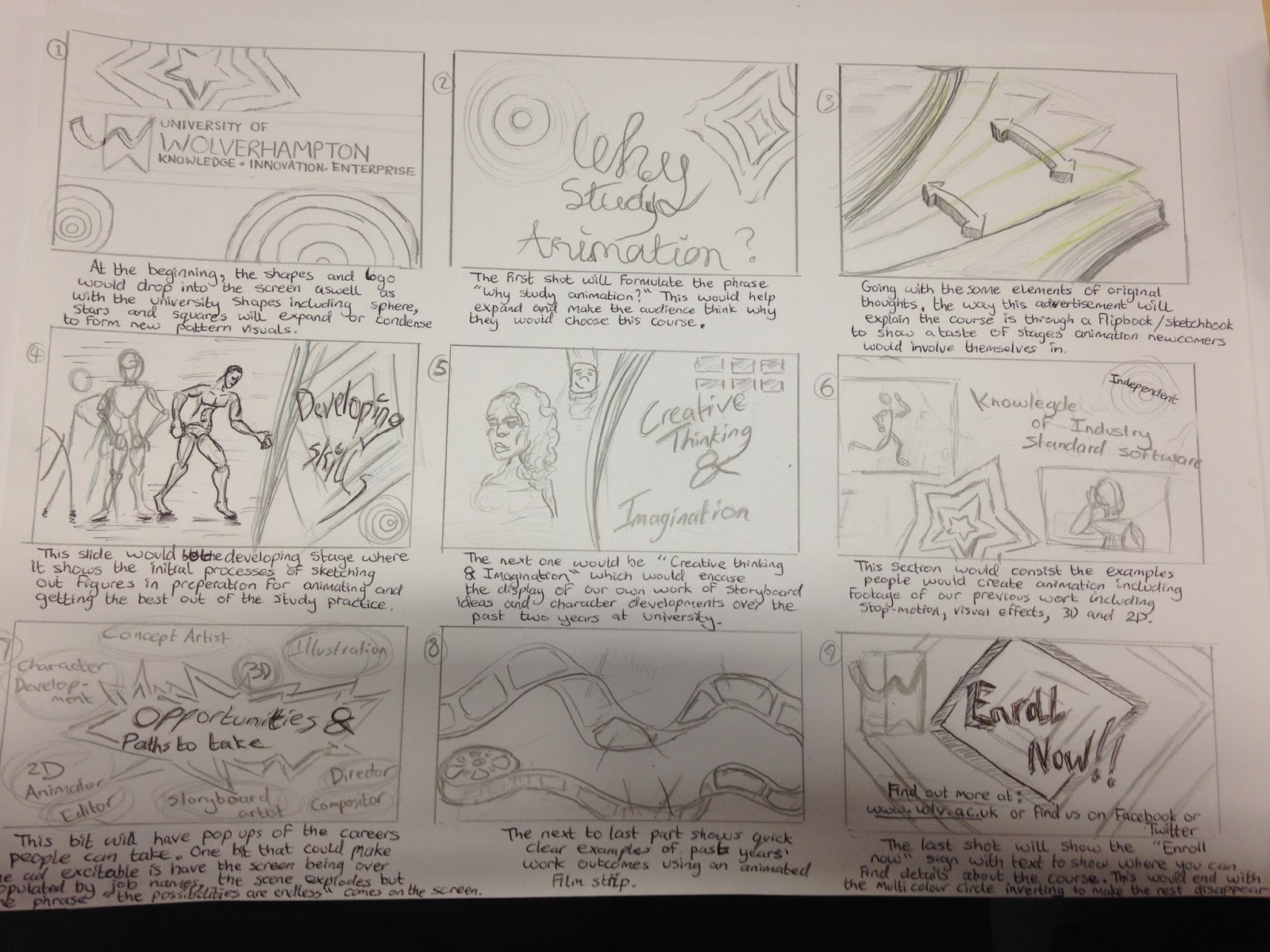
For our professional project me and my fellow colleague Andrew Taylor have been doing more advanced storyboards for creating an advert based around the chosen client, university of Wolverhampton.

words to describe the learning experience of animation (since it be text based we would need to be able display words and descriptions that clearly specify the course's nature.
  • development
  • being about to work independently 
  • versatile
  • self expression
  • learning new software
  • creative thinking and imagination
storyboards:

small test of logo
This is a small test of what Andrew did with the university logo and shapes in After Effects.

music selections and tests

All sounds are found on this site:
 http://dig.ccmixter.org/free

Zest - http://dig.ccmixter.org/files/basematic/34457
Zest by basematic (c) 2011 Licensed under a Creative Commons Attribution (3.0) license. http://ccmixter.org/files/basematic/34457 Ft: urmymuse 

the dice are thrown - http://dig.ccmixter.org/files/myfreemickey/39210
the dice are thrown by My Free Mickey (c) 2012 Licensed under a Creative Commons Attribution (3.0) license. http://ccmixter.org/files/myfreemickey/39210 Ft: the dice

Urbana-Metronica (wooh-yeah mix) - http://dig.ccmixter.org/files/jlbrock44/33345
Urbana-Metronica (wooh-yeah mix) by spinningmerkaba (c) 2011 Licensed under a Creative Commons Attribution (3.0) license. http://ccmixter.org/files/jlbrock44/33345 Ft: Morusque, Jeris, CSoul, Alex Beroza

Spinnin' - http://dig.ccmixter.org/files/AlexBeroza/32423
Spinnin' by Alex (c) 2011 Licensed under a Creative Commons Attribution (3.0) license. http://ccmixter.org/files/AlexBeroza/32423 Ft: spinningmerkaba

Drops of H2O ( The Filtered Water Treatment ) - http://dig.ccmixter.org/files/djlang59/37792
Drops of H2O ( The Filtered Water Treatment ) by J.Lang (c) 2012 Licensed under a Creative Commons Attribution (3.0) license. http://ccmixter.org/files/djlang59/37792 Ft: Airtone

Route 17
Route 17 by djolliej (c) 2012 Licensed under a Creative Commons Attribution (3.0) license. http://ccmixter.org/files/djolliej/35850 

260809 Funky Nurykabe
260809 Funky Nurykabe by spinningmerkaba (c) 2010 Licensed under a Creative Commons Attribution (3.0) license. http://ccmixter.org/files/jlbrock44/29186 

WHEN THE SKY TURNS BLUE
WHEN THE SKY TURNS BLUE by BOCrew (c) 2011 Licensed under a Creative Commons Attribution (3.0) license. http://ccmixter.org/files/BOCrew/31685 Ft: THEDEEPR / THE CORNER

quicksilverscreensaver
quicksilverscreensaver by septahelix (c) 2011 Licensed under a Creative Commons Attribution Share-Alike  (3.0) license. http://ccmixter.org/files/septahelix/33352 

Rise Up To Heaven (Instrumental) - 
Rise Up To Heaven (Instrumental) by spinningmerkaba (c) 2011 Licensed under a Creative Commons Attribution Share-Alike  (3.0) license. http://ccmixter.org/files/jlbrock44/33913 Ft: Fireproof_Babies
(might use on show reel)

New York City (Instrumental)New York City (Instrumental) by spinningmerkaba (c) 2011 Licensed under a Creative Commons Attribution (3.0) license. http://ccmixter.org/files/jlbrock44/30389 

Metronomix - 
Metronomix by CSoul (c) 2011 Licensed under a Creative Commons Attribution (3.0) license. http://ccmixter.org/files/CSoul/33157 Ft: spinningmerkeba,Jeris,morusque